
Monitoring
The overview page (also sometimes referred to as "monitoring page") was designed to keep track of what's happening in your project. You can inspect the labeling progress, amount of heuristics, label distribution, and much more. The best thing about it: you can display all those statistics and graphs on pre-defined slices of your data and for singular labeling tasks.
Analyzing label quality, distribution, and user agreement
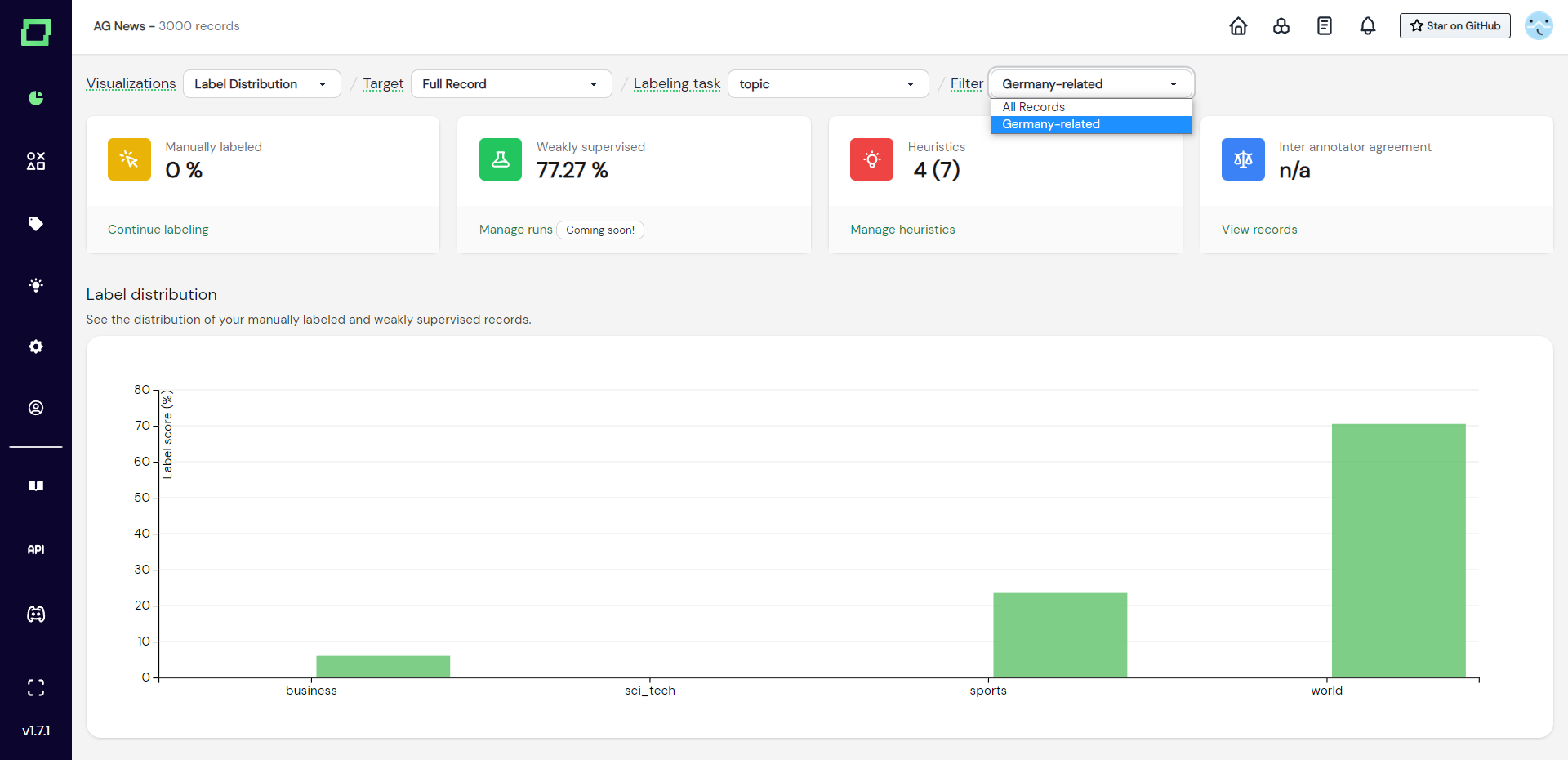
Before inspecting statistics and charts about your project, always make sure to select the right target, labeling task, and data slice at the top of the page.
That being said, the easiest way to get a glance at how far the project progressed is by inspecting the aggregated statistics at the top of the page. Here, you can see the amount of manually labeled data, weakly supervised data, heuristics, and finally (if you're on the managed version) the inter-annotator agreement. You can hover over all of these to get more details.
The following subsections will cover the available visualizations.
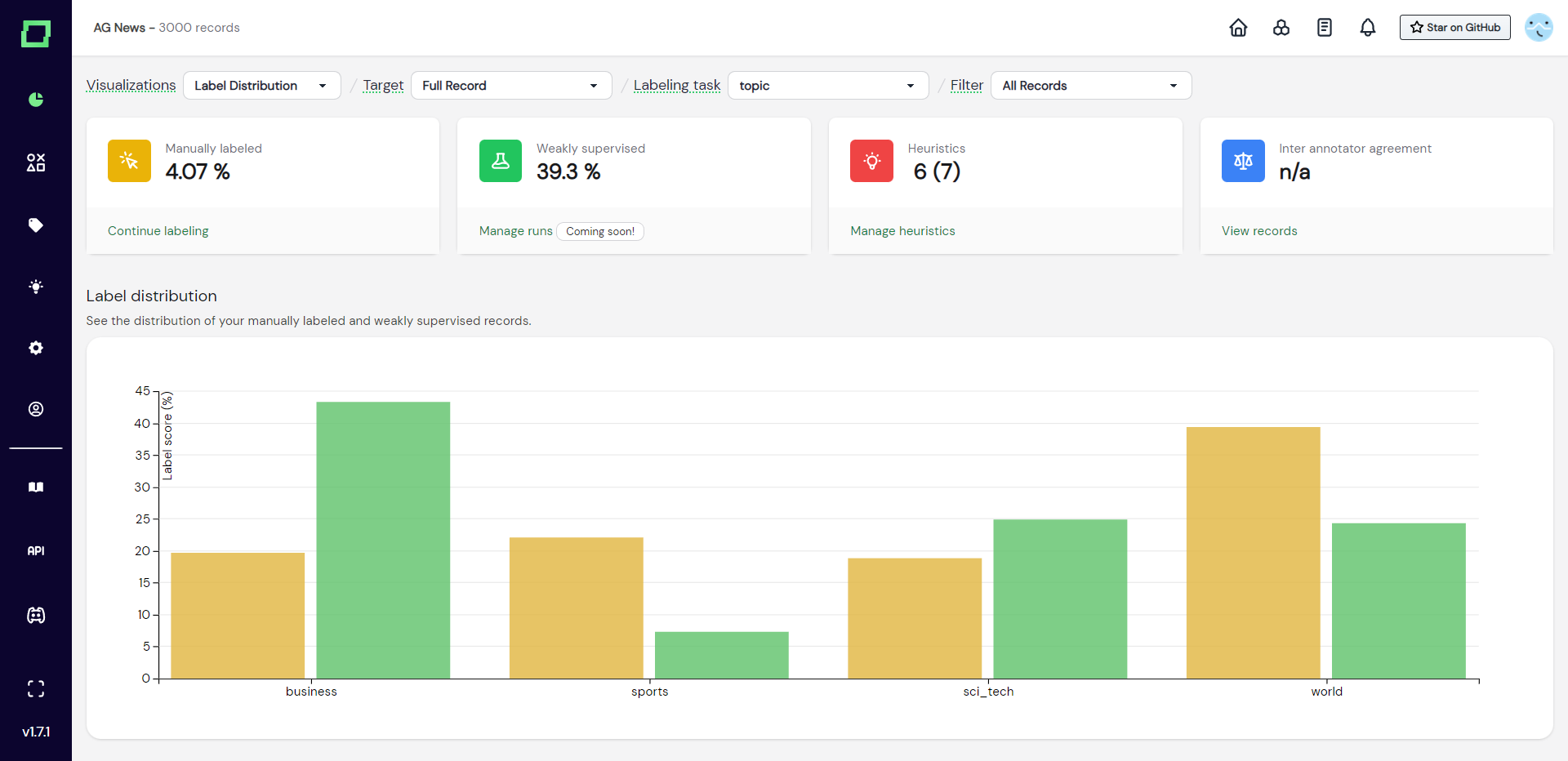
Label distribution
This grouped bar chart (see Fig. 1) shows you the distribution of labels given, grouped by the label names. The different colors indicate whether the label has been set manually or by weak supervision. If you hover over the bars, you will get more details.
This chart is very useful to spot under- or over-represented classes, which might indicate the necessity of splitting up or merging two labels in order to get a relatively balanced training dataset. Also, the distribution of the manually labeled and weakly supervised data should roughly match as you otherwise would over- or under-represent classes through the strong scaling of weak supervision. If they do not match roughly, consider adding more heuristics to the classes that are struggling to keep up and consider temporarily removing heuristics of the overrepresented class.
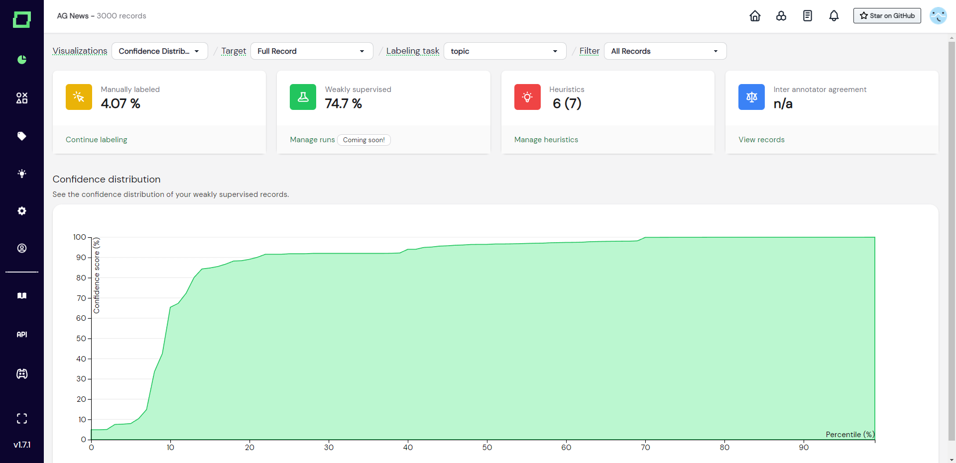
Confidence distribution
The confidence distribution chart displays the percentiles of weakly supervised data plotted against the weak supervision confidence score. This chart is important to inspect in combination with the total amount of weak supervision labels, as you are usually most interested in the data that was labeled with high confidence. The chart is to be read as follows: in Fig. 2 you see that the 40th percentile is plotted against a ~90% confidence score. That means that 40% of your weakly supervised data is roughly between 0 - 90% confidence.
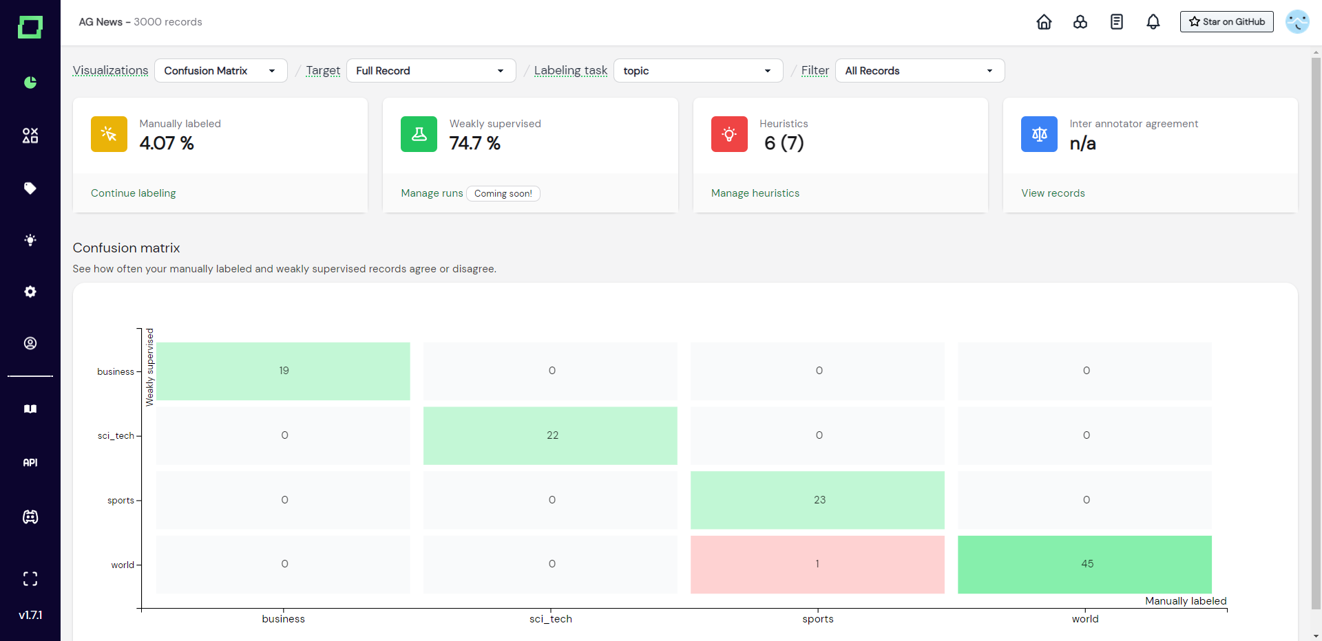
Confusion matrix
The confusion matrix is your key visualization in understanding weak supervision quality. It plots the weakly supervised labels against the manual reference labels, which lets you see where weak supervision succeeds and fails at a quick glance. This is especially powerful in combination with the data browser filtering as you can then just select the labels with the highest disagreement and manually confirm if these were in fact mistakes of weak supervision or labeling mistakes. Use this chart to iteratively refine your heuristics and weak supervision.
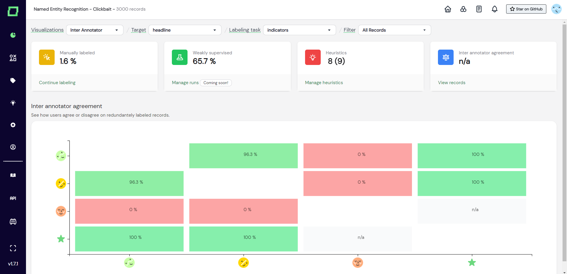
Inter-annotator agreement
If you are on the managed version of refinery, you automatically get multi-user support. As there are now potentially many different labelers, there also might be different opinions among their labeling. With the inter-annotator agreement, you can see how much user agree or disagree at a single glance. This can help you bring people together who seem to have a different understanding of the labeling task at hand. For example in Fig. 4, the user with the red avatar should really talk to the other labelers.
Analyzing metrics on static slices
You can also reduce the record set that is being analyzed on the overview page by selecting a static data slice in the top right dropdown. This way, all graphs and statistics will be filtered, giving you deeper insights into your potential weak spots.
To learn more about data slices, read the page on data management.