Comments
When you are working with multiple people on one project, comments become super helpful to better communicate in an asynchronous manner. For example, during labeling the records, there might be a record that you marked as "business" and your colleague marked as "world". This induces some ambiguity that can also be seen in the inter-annotator agreement on the monitoring page. In order to avoid confusions, you can add a comment explaining your decision and read other opinions of your colleagues. You can create comments anywhere inside a project by clicking on the comments icon in the upper navbar (left of the notification center).

Clicking the comments icon will open a sidebar, where you can see existing comments made by your colleagues. These are bound to project entities such as labeling tasks, data slices, or even on record level. Comments are highly valuable e.g. if you want to set up a crowd labeling heuristic and want to help your annotators understand a labeling task.
An important thing to notice here is that the comments have restricted visibility. This means that some of the comments might get hidden when you navigate to a section of refinery where this comment might not be needed. A very good rule of thumb is: if you can interact with a certain entity on the page you are on, you will also see the related comments for it, e.g. comments on data slices are only visible on the monitoring page and the data browser as these are the only places where you'll interact with them.
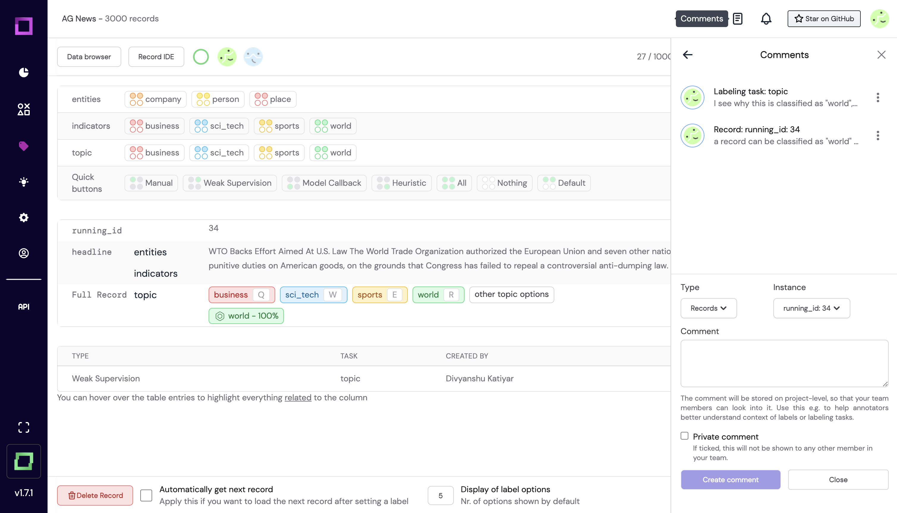
A visual example: in Fig. 1 you can see that the comment section has two comments, one for a labeling task and the other for a record.
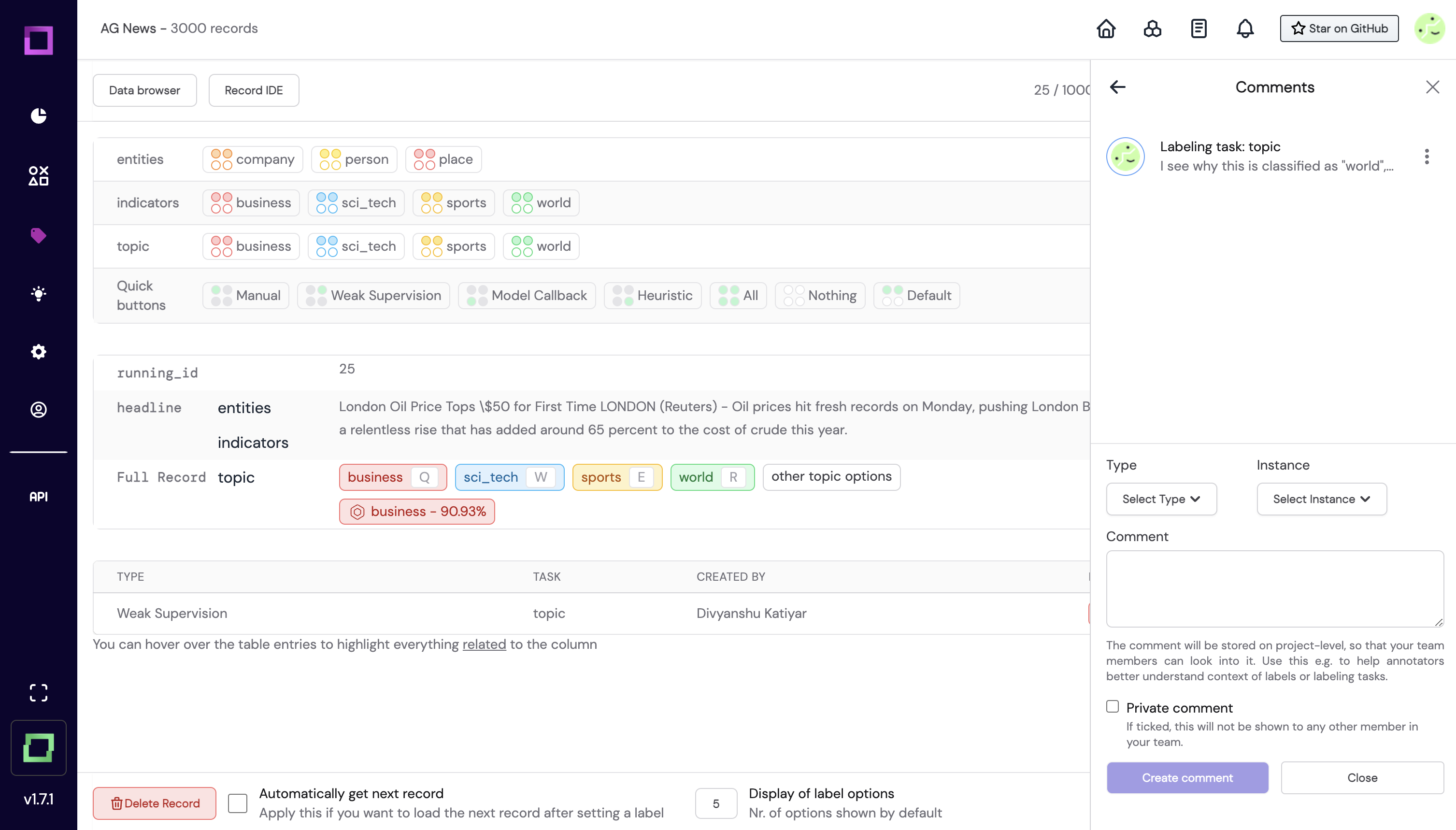
The record comment has an instance associated with it, which in this case is the record with the record_id of 34. If you try to view the comments while being on a different record (record_id != 34),
you won't see it anymore. This visibility feature is important for refinery since otherwise your comments could become crowded really quickly.

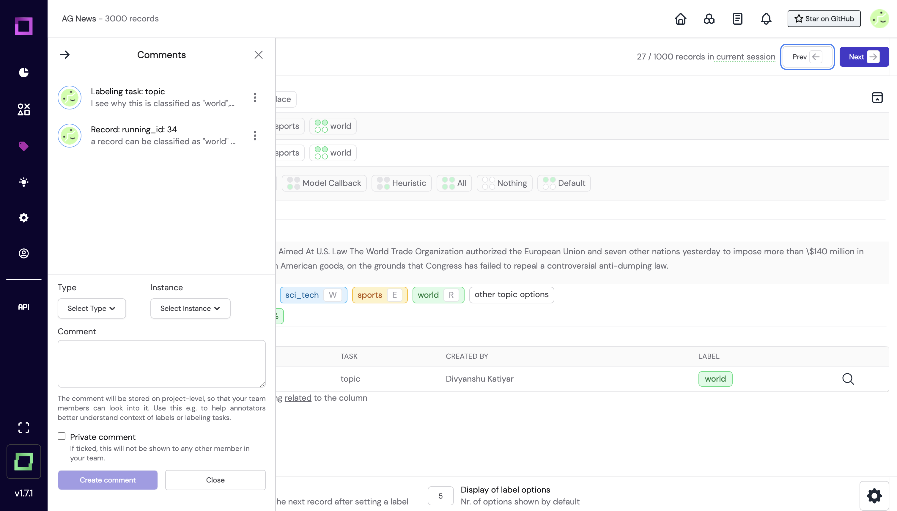
The comments panel is designed in such a way that you can always choose which side of the page you want to see the comments as it can sometimes happen that you're writing a comment, but want to refer to something obstructed by the comments sidebar.

As you can see in Fig. 3, the comments sidebar is now on the left side of the page which can be done by clicking on the arrow icon on the top left of the comments prompt.